This are the steps I follow to make responsive versions of my premades. I’m using the WordPress theme from Premade #08 for this tutorial.
Needed: WP installation, WP theme to convert, a way to test responsiveness – I use Firefox’s Tools > Web Developer > Responsive Design View.
Step 1: Delete everything in style.css, it’s much easier to start from scratch. Now the theme looks like this:

And like this in Responsive Design View (320×820):
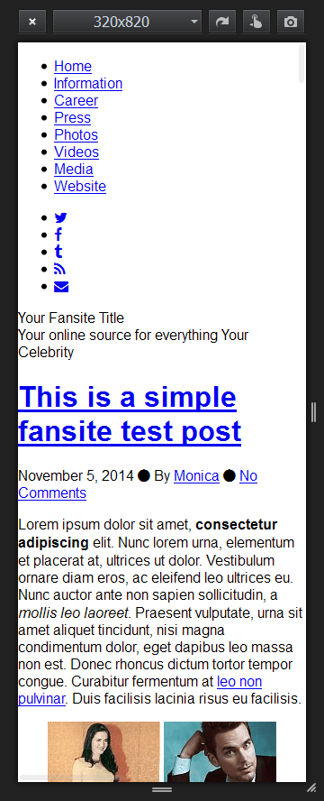
Step 2: Start adding the style back and make the changes you need.
The responsive menus:

The responsive header and starting to style the posts:


Tips:
– Use max-width as much as possible, to make everything flexible.
– Add padding left and right of your main wrapping container to make it look good on smaller screens.
Step 3: Make the final style.css – take the original style.css and add the changes for the responsive version by using media queries. Read more about media queries on W3Schools.
The media queries wrap the changes you want to the main style according to the size of the device your visitor is using to access your site:
@media (max-width: 959px) {

  your responsive style here

}
You have to cancel out some of the rules from the main style, in which case put in the media query the default value for the rule.
Example: In the desktop version, the main menu is float:left, and the social menu float:right. I don’t need this in the responsive version, where all the menus are centered, so I put float:none in the media query:
@media (max-width: 959px) {

	#nav-menu {

		text-align: center;

	}

	.header-menu {

		float: none;

	}

	.social-menu {

		float: none;

	};

}
I use W3Schools to find the default values of the rules I want canceled: the header in the desktop version has height: 360px; and is canceled by height: auto; in the media query.
Step 4: Fitting all sizes: There are way to many devices out there, displaying the www in different dimensions. The only way to ensure your theme will look good on all of them, is to use as many media queries you see fit. I check the site by playing with the responsive device view width and making changes where it stops looking good.
This premade turn up to have main breaking points at 359px, 734px, and 959px:


Check the final result: Live demo.
Updates:
1. Use the Responsive Meta Tag in the header.php. You can read a detailed explanation about it’s importance at CSS-Tricks:
<meta name="viewport" content="width=device-width, initial-scale=1">
2. I’m using a more mobile-friendly menu now, especially if you have a lot of items in your navigation. Check out the guide I used to make it at Medialoot, and a screenshot of it in use in Premade #11:
